This time, MODI and his marketing, online. Hey, That rhymed!
Some of us witnessed the results of biggest ever political elections in the history of the world in 2014, let’s take some time out to see how BJP (Bhartiya Janata Party) used online marketing to drive home the message which being
“Ab ki baar, Modi Sarkaar” (Translation: This time, Modi Government)
To be very honest, the tagline is one of the better taglines that we come across. It’s short, catchy and tells exactly what it’s supposed to in simple words as opposed to the tagline being used by Congress (it’s counterpart and current ruling party), which says,
“Har Hath Shakti, Har Hath Tarakki” (Translation: Power and Development to everyone)
This post will neither talk about the political agenda of the two parties, nor will it try to give an opinion on the current election and why you should or should not vote for a particular political party for whatever reasons, because we all know that it’s to no end one can justify to a certain political party coming to power, so for now, Que Sera Sera.
Sticking to the core objective of this blog, this post will only be talking about the online web presence used by Bhartiya Janata Party in terms of banners because I feel there is a lesson or two in them. Specially when political parties have decided to spend around Rs. 400 crores on Digital campaigning according to a study quoted here
Let’s first establish a few facts from BJP’s end.
What’s their marketing and communication objective?
In all their marketing campaigns, collaterals, images, copy and creatives, one thing is common, they are “shouting” for change and they are betting on Modi. BJP has never been the highlight in any of their marketing communication online or offline. They are trying to talk to the public of India saying that “you should be done with corruption, crimes, scams, underdevelopment and you should vote for change”. Vote for better days, vote for Modi, not BJP, but Modi.
It’s not “Abki baar, BJP Sarkaar”, it’s Modi Sarkaar.
Narendra Modi being one hell of an orator that he is, clubbed with “Gujarat development model” that he is selling, the message is already playing on people’s mind that he will do to whole of India, what he did in Gujarat (I am talking about the proposed development model here). In that hope, majority of the people have faith in Modi his leadership skills and administrative quality.
The communication strategy is clear and straight from the marketing books,
- Specify a problem
- Identify a need
- Present a solution
Hook, Line and Clincher! Boom!
Also, the kind of media and advertising investment both monetarily and intellectually that has happened in the ongoing elections has far exceeded the same in any other election in Indian history and right now this stands to be the second biggest spends next only to US presidential elections in 2012.
Source: http://bit.ly/1s3gPY0
Now, let’s look at how BJP is trying to meet the above communication objectives with online marketing.
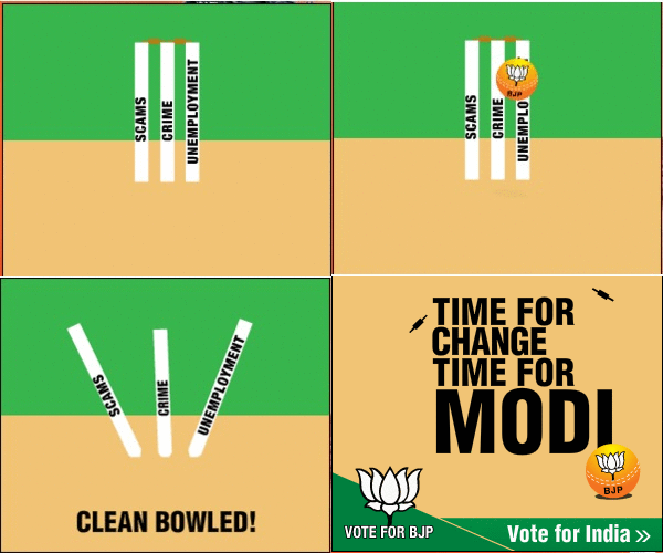
I have come across, till now, 3 types of different creatives of online banners running for Modi campaign. All 3 types have tried to convey and put across the same message which is “Modi”, again, not BJP, is the answer to all the problems that are ailing India right now.
The banner is quite simple in terms of copy and execution and aptly puts across the message, highlights the 3 problems, shows BJP as the need and presents MODI as the solution.
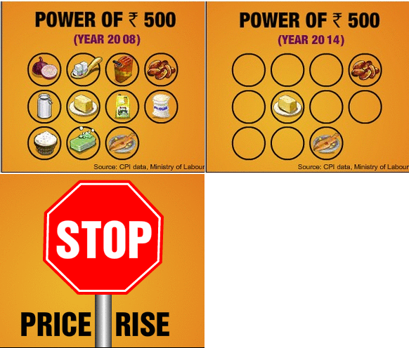
Problem no. 2 – Inflation, again the creative execution is simply very good, all the basic necessities in life, CPI data duly quoted for people who would want to doubt the credibility and finally the CALL TO ACTION.
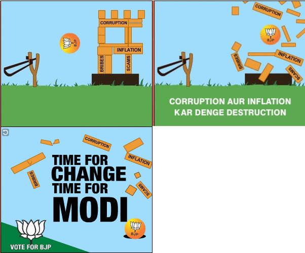
If you notice, the consistency in the banners is impeccable, and these are not banners which are worried about small metrics like “impression share”, “click rates”, I am sure they are out with one and only objective, be out there on every website as much and as often as you can. Who would not want to be in marketing team like that?
Although, the copy here is quite passable, still a good banner which will drive home the point to 30% voters who come under the Indian internet audience according to ASSOCHAM.
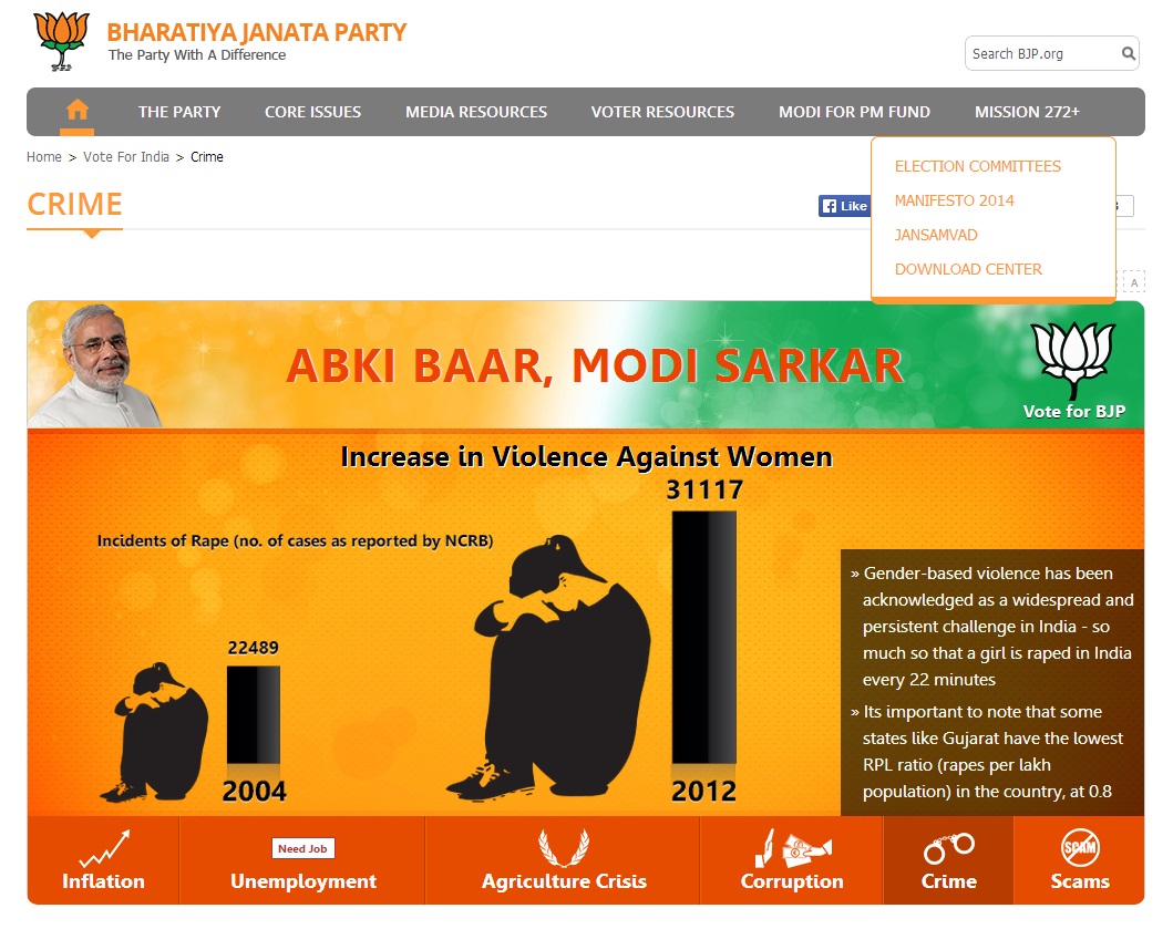
Another issue, being taken up by BJP, however, they could have used a better analogy than to say that it looks good in movies. When you click on the banner, you are taken to a landing page, which does talk about the seriousness of the issue with statistics and figures to convince you that we do need a change, not this particular banner though.
If the above banners might seem run of the mill and nothing path breaking apart from the consistency in which they have been positioned, you have to see the banners below, I doubt if I have come across such an engaging banner in the last 1 year.
Also, modern online marketing is more than just counting the number of clicks on your banner but it is more about the message being registered in the clutter of banners in the online world on any given page showing ads. It’s more about engagement metrics like time spent, which is where the below banners become a case study.
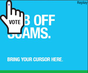
They are calling it the “RUB-OFF CAMPAIGN”
Now, notice the default position of the hand (cursor) here, it shows some text and hides some text, it could have easily been placed somewhere else, but just because it’s hiding a significant part of the banner you want to remove it from it’s place and see what’s actually written there, and once you start doing it, the blue screen starts rubbing itself off to reveal something else.
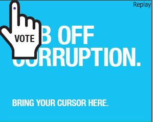
The above is the default way in which the banner is visible to you. Different types of issues from scams, corruption, missed opportunities, unemployment, being asked to “rub off”
As you start moving your cursor, you see the banner screen bring cleared to show a frame hidden inside.
As you keep, moving your cursor on the banner, trying to wipe out the blue screen, the “apparent” solution to all of India’s problems becomes visible and the message is very smartly delivered and registered with a brilliant engagement rate and wow factor.
The beauty of online banners of political parties is that they dont have to make people “register” or “sign up” to track a conversion. They only have to engage them. BJP and MODI’s online banner meets that particular objective in a brilliant way. The other thing to note down is the way in which the consistency in communication has been maintained where everything is aligned, Congress bashing, Modi Selling, no other option, india’s only solution, abki baar, modi sarkar.
The landing page to all the rub off campaigns was this
http://www.narendramodi.in/ which in itself is quite a sophisticated microsite with all the possible information you need to be aware of the current state of India under Congress and what it can be under BJP, sorry, MODI.
Let’s get to the point!
The point is people in marketing have a very bright future it seems if the biggest ever spectatcle in Indian history is taking refuge and being so dependent on marketing and advertising. The other point is the way in which Modi Sarkar has managed to give a corporate feel to it’s advertising and marketing efforts. These are not banners that were made overnight unlike the OOH hoardings that we usually see in cities. A lot of thought and effort has gone into deciding the perfect communication. The other good thing is it’s very easy to get either carried away by online marketing for a political campaign by being too classy and smart for the audience to understand but the agency handling Modi’s online marketing knew exactly what they need to convey without trying to do too much.
Read more about BJP borrowing the corporate look and feel of it’s ads from top advertisers.
BJP has far exceeded in online marketing in this prachaar, we only have to wait and watch if this actually translates to “ab ki baar..”
If after reading all of the above, you are wondering, where is all this money for marketing coming from in a country where poverty line is defined as Rs. 32 per day. You can probably check out the video being circulated by AAM AADMI PARTY and make your judgement.


