The making of a good-looking email newsletter
On this blog, we have often covered different aspects of email marketing. The reason being that the medium still remains intriguing and absolutely important in your online marketing mix.
- For Retail & e-Commerce and Travel sector the primary e-Marketing activity is ‘Email Marketing’.
- Importance of email marketing grew 38% from 2011 to 2015
- Social media and Email Marketing remains top 2 sources for customer engagement
- Blogs & email newsletters remain number one source to deploy your content marketing campaigns
- 59% of Indian marketers send at-least one email every week
- Email is becoming the new favourite of marketers as SMS faces DND issues and stricter TRAI regulations.
- 49% of marketers are using email as a tool effectively with sending over 50,000 emails monthly.
The statistics presented above clearly prove the significance of email marketing and email newsletters with regard to factors such as customer retention and brand awareness. Email is an important medium of communication in the digital marketing piece and it is here to stay.
Renowned media columnist David Carr wrote
“Email newsletters, an old-school artefact of the web that was supposed to die along with dial-up connections, are not only still around, but very much on the march.” (NY Times, June 2014)
A business may essentially send out two major types of emails to communicate with users.
- Product Mailers
These are usually system triggered, template mailers sent on particular actions that a user might take on the website. For example, sign up, feedback, order confirmation, password change or any other notification. See more examples here.
These emails are important for a seamless, good user experience. Engagement rates on these mailers are usually high because the user is actively waiting for this in their inbox. These emails when coded right also land in the “Updates” folder of your Gmail inbox.
- Promotional Mailers
These are push marketing mailers which notify users about offers, ongoing campaigns or simply a product showcase. Check examples from foodpanda and other brands.
———————————————————————————————————-
Apart from the ones mentioned above, a very important type of email communication, heavily adopted by both small and large businesses alike are the email newsletters.
Email Newsletters have most certainly evolved since they were first conceived of. They have moved on from being drab, boring and text heavy to becoming well designed, eye catching, witty and interactive. There are pros and cons to both types of email newsletters.
In the current times, some relatively young and quirky brands have redefined the look and feel of email newsletters.
Presenting to you the anatomy of the ‘almost’ perfect email newsletter with examples from Urban Ladder, Chumbak, Myntra & Scripbox.
The Header & Footer
Why is the header of an email newsletter or any email, important?
The user sees 3 parts when they receive an email in the inbox.
- Sender’s Name
- Subject Line
- Email Preview
Whenever you decide on your subject line you really need to ask yourself, “Will I open this email if it comes to my inbox?”
Your first words in the email become the email preview and you don’t want to be reading something like below.
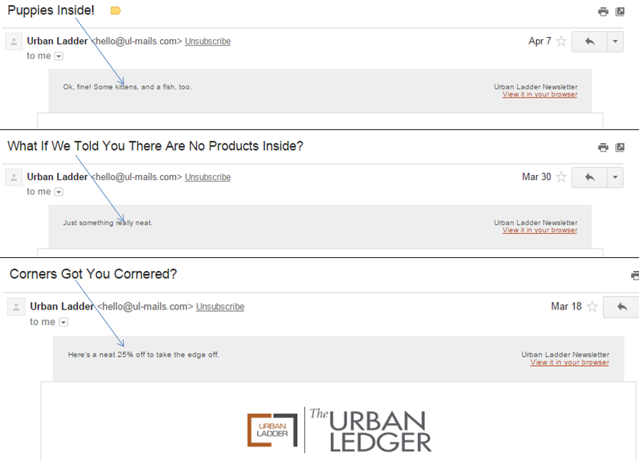
When you incorporate a header format in your mailer itself, the preview is the chance to give users an extra hook to open your email. Below is what Urban Ladder headers look like.
This is how they look when they reach your inbox.
I have already stressed a lot on why subject lines are really important for your email marketing. Read on ways to improve your email open rates through effective subject lines by clicking here.
Apart form the first line that I mentioned above, the header format should also incorporate the brand name and a standard template going to be used in your mailers.
A unique name for your newsletter gives you a chance to differentiate the communication and purpose of the newsletter from your other standard emails. The Urban Ledger below is a good, contextual play on words considering their brand and business category.
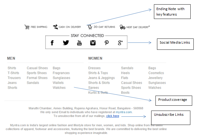
The footer helps you end on a credible, strong and friendly note. You need to keep reminding your customers that before them you value your own content. You need to make them believe that if at any point they don’t like what they are reading, they are free to leave and have the simplest one click unsubscribe option. This is necessary because you don’t want your customers to go out and tell other that they regret signing up with you and worst they don’t want you to start marking as spam hurting your credibility with Gmail.
The footer also helps you announce that you are active and available on social media. Closely observe following you receive as a result of this and if it makes sense there.
Content
After we have taken care of the hygiene part of newsletter, lets concentrate on the message bit. Email marketers in the industry constantly struggle with low open and click rates. While open rates are entirely a function of how well you have written your subject line, click rates depend a lot on how engaging and relevant your email communication is.
Open Rate = Number of Emails Opened / Number of Emails Sent
Click Rate = Total number of Clicks / Number of Emails Opened
Talking about content, both Urban Ladder & Chumbak nail it every single time. There has not been a single Urban Ladder email that I have not scrolled down till its end.
Chumbak, staying true to its brand essence of being cool, quirky and kitschy recommends for the user, songs to listen to or books to read this weekend while pitching for its products. This strategy is a slighly unusual one. However, it not only encourages the user to browse throught the mailer but if they do end up liking the recommendations, the chance that they might also give a go at their products is higher.
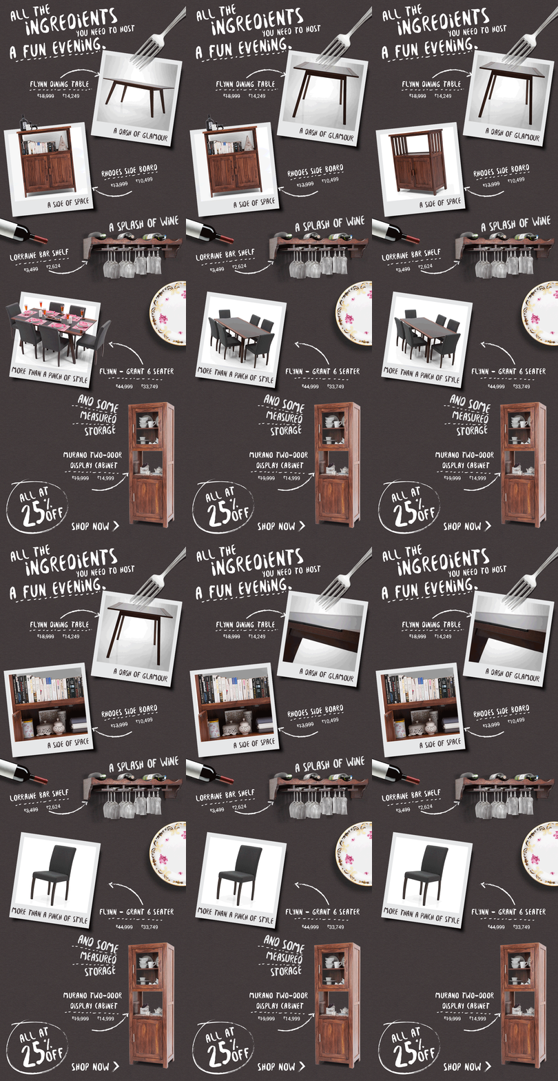
Urban Ladder uses gif images to its advantage in most of its mailers, adding to the fact that the user would always like to look at furniture in three dimension. They also try to weave a funny story around it keeping the mailer all classy and relevant. Instead of pitching products in the usual categorized way they do something like below which is way more interesting and cool.
Here are some really engaging email newsletters that I have received in the past from different brands but the ones that really stayed with me were majorly from Urban Ladder.
URBAN LADDER
Subject Line:Prepping to Play Host?
Use of gif images and an interesting story to create the need of party furniture in your house
CHUMBAK
Subject Line:The Dinner Party Guide from Chumbak
An extremely neat and quirky integration of products. An interesting thing to notice is that Chumbak is also giving you the link to curated music content on its blog making the brand selflessly connect with the consumers and not pure transaction.
URBAN LADDER
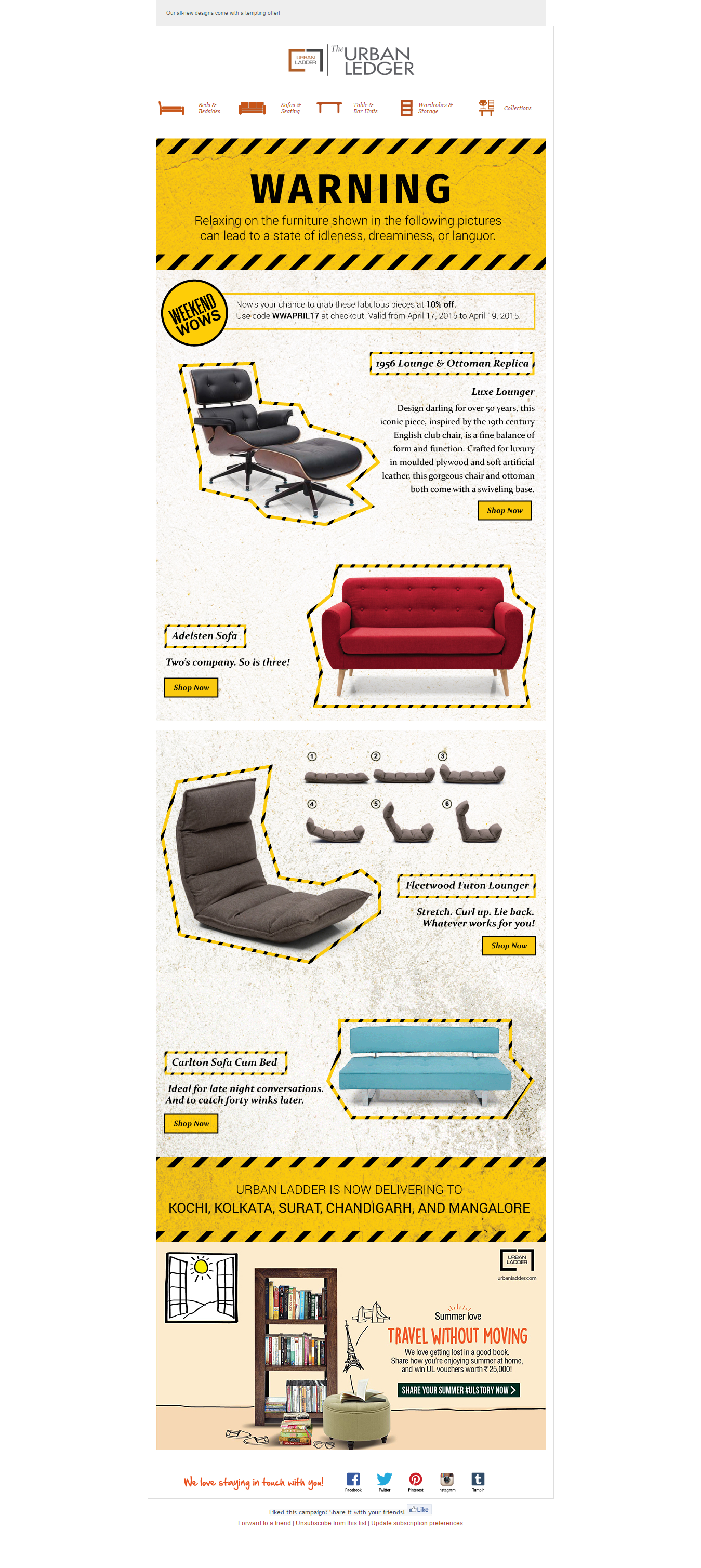
Subject Line:Warning : Dangerous Curves Ahead
The subject line is reason enough to catch your attention. The content inside makes your click worthwhile as they show some investment that has gone in making the newsletter from marketing, content, product and design.
MYNTRA
Subject Line: The art of nailing modern work wear and making heads turn.
The subject line could have been better however the newsletter inside does an awesome job at engaging you. This newsletter just deserved a better subject line.

Myntra plays on “getting the perfect look” by giving users to shop the entire package to the style and role that suits them
SCRIPBOX
Subject Line: Everything You Need To Know About Your Salary Slip
A relatively new and serious brand does a good job at a newsletter by making sure all hygiene factors are in place. Your newsletter need not be filled with images for it to look nice. The key will always be in the content. That will always be, for lack of a better role, the king. Scripbox starts of with a good header and footer, gives decent hooks in between to capture interest and good quality content to get the user interested in their service. Content Marketing 101.

When you are a content heavy serious business and still need to look professional you can do what a new brand like Scripbox does. Serious yet neat and good-looking.
Practicing what I preach
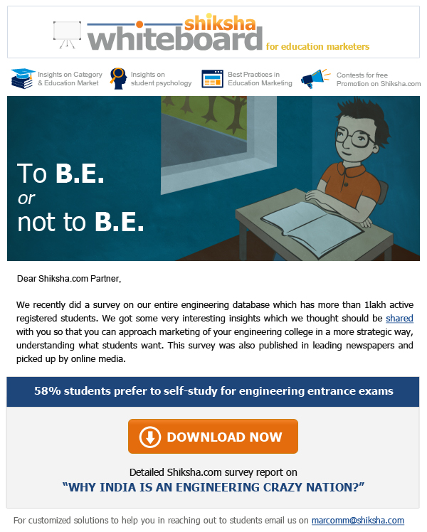
I admit that I get inspiration from fellow Indian marketers and brands to practice in my job as a marketing manager for Shiksha.com. Here is how I adopted the learnings from various newsletters to design my very own B2B newsletter called “Shiksha Whiteboard”
What do we know? What have we learnt?
- Pay heed to the basic format of a newsletter and incorporate that, the first thing
- Understand the boundaries within which your target group lies. Based on that weave engaging content and encourage a two-way communication. Don’t merely push your product in the consumer’s face.
- Monitor the newsletter performance regularly and chalk out your future strategy based on that







July 15, 2015
Great Stuff! 🙂
July 15, 2015
Hi Navin,
Thank you so much. Good work by you and your team. Keep the newsletters coming 🙂
Regards,
Prateek Malpani
October 26, 2015
Hi Prateek,
I wish to know how can create HTML emailers that run perfect on email marketing platforms like Marketo.
Are there any best practices or any demo site to test our HTML?
November 19, 2015
But how do we bypass the email filters which block images. If your whole email is an image nothing will be shown on the customer’s page. Won’t that be a big problem.
November 21, 2015
Hi Jonah,
Thank you for reading. Most of the emails now are being opened on mobile phones and a large part of it through Gmail. In 2013 Gmail has started downloading images by default. Check out this article – http://www.practicalecommerce.com/articles/62243-Gmail-to-Download-Images-by-Default-Affect-on-Ecommerce
July 27, 2016
This is a wonderful read, and also was waiting for someone to write on it, especially on UrbanLadder newsletters. I automatically click on their emails if not go to the website to check out their products. Really makes my day to go through their brilliantly designed and funny newsletters.
July 28, 2016
Hi Faree,
Thank you so much. Completely agree with you. It is a great example of how content, marketing and design teams can work together towards a common goal of getting more users on the website. Keep reading.
December 24, 2016
Great! Thanks for Sharing!